November 14 2019 at 05:13PM
Project. Collaboration. Determination. Change. (EN)
Editorial
PMI scored twice at this year's global congress in Philadelphia. First, there was the 50th anniversary celebration. And secondly, the whole congress was completely re-designed in a Night & Mist action.
Why a new brand? Quite simply because PMI has evolved, moved on and is strategically repositioned. It used to be about PMBoK, inputs and outputs but now we think in outcomes and instead of working software, it's about consumable solutions. If the PMP was for the Lord (!) Technical Project Manager, today we are in a world of methods, models, diversity. From frameworks to Whatever Works. We are in a most diverse environment with a wide range of objectives and an ever more colorful potpourri of best practices, all of which work well, and all have their place. We operate in a portfolio of projects, a world of projects – the project economy. Amid this world stands PMI, the world's largest project management organization with its personalities, actors and members.
Why these colors? As an organization, as a brand, you have a personality. This is visible through its appearance and colors. The three new colors of PMI express three core elements of our personality:
FEARLESS.
We’re unafraid to try new approaches, we learn from our failures and move forward, paving the way for those brave enough to do the same.
BRIGHT.
We enlighten and energize people to make a difference in their careers and an impact in their communities.
NURTURING.
We understand what our community needs, help people get where they want to go, and celebrate them along their journey.
What do the symbols mean?
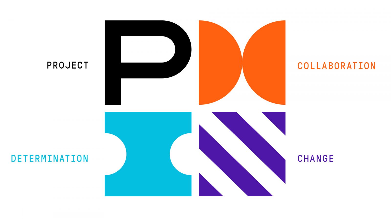
 The most important symbols can be found directly in the new PMI logo
 It is a combined mark – on the left is the logo and on the right is the word. The logo mark alone is used only when it is clear what it is. The most important symbols can be found directly in the new PMI logo.
 The root of our success has
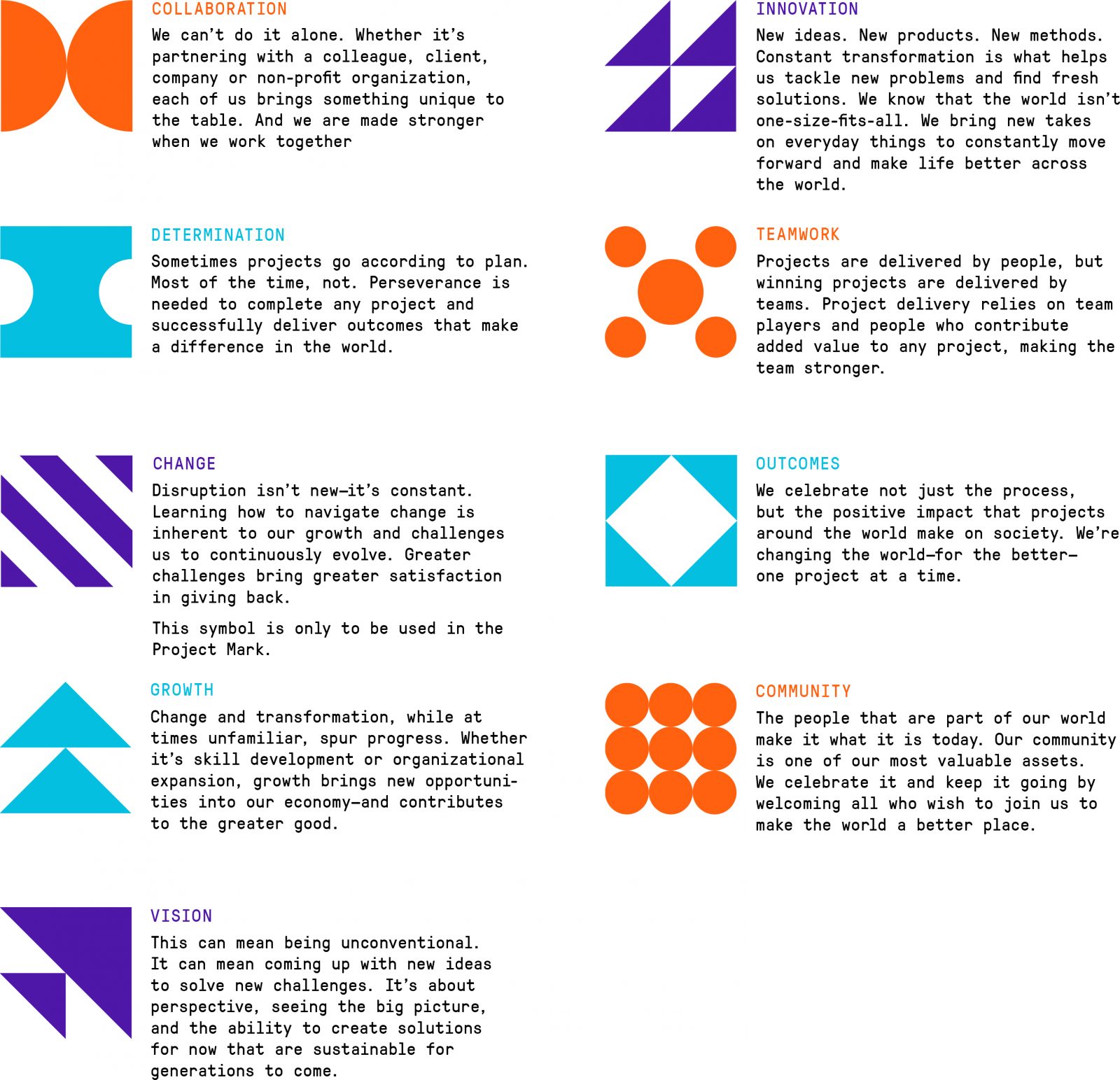
COLLABORATION
,it grows through
DETERMINATION
and lives on by constant
CHANGE
. All other elements with their meaning are now present in our graphical language.
Chic? In any form of visual design and even more so in the redesign of a whole brand appearance, it is inevitable that one’s own taste comes through. It is well known that this can be arguably disputed and even the best designer cannot get it right for everyone. As strange as it may sound, a brand should not be just to please, it should be understood and make sense in its application. And even if a new brand may take some time for people to get used to its appearance, it will soon come to life and be accepted very quickly. PS: The Austria Chapter appearance is being redesigned in consultation with our members. We'll get back to you!
The root of our success has
COLLABORATION
,it grows through
DETERMINATION
and lives on by constant
CHANGE
. All other elements with their meaning are now present in our graphical language.
Chic? In any form of visual design and even more so in the redesign of a whole brand appearance, it is inevitable that one’s own taste comes through. It is well known that this can be arguably disputed and even the best designer cannot get it right for everyone. As strange as it may sound, a brand should not be just to please, it should be understood and make sense in its application. And even if a new brand may take some time for people to get used to its appearance, it will soon come to life and be accepted very quickly. PS: The Austria Chapter appearance is being redesigned in consultation with our members. We'll get back to you!
The most important symbols can be found directly in the new PMI logo
The root of our success has
COLLABORATION
,it grows through
DETERMINATION
and lives on by constant
CHANGE
. All other elements with their meaning are now present in our graphical language.
Chic? In any form of visual design and even more so in the redesign of a whole brand appearance, it is inevitable that one’s own taste comes through. It is well known that this can be arguably disputed and even the best designer cannot get it right for everyone. As strange as it may sound, a brand should not be just to please, it should be understood and make sense in its application. And even if a new brand may take some time for people to get used to its appearance, it will soon come to life and be accepted very quickly. PS: The Austria Chapter appearance is being redesigned in consultation with our members. We'll get back to you!

